- Brand Positioning & Messaging:
- Core Concept: “Real Strength, Naturally” – emphasizing Ayurvedic authenticity and real-user results.
- Tone: Motivational yet educational, blending fitness energy with Ayurvedic wisdom.
- Visual Identity System:
- Color Palette: Earthy greens (natural/herbal) + bold oranges (energy/vitality) for contrast.
- Typography: Strong, muscular fonts (e.g., Bebas Neue) for headlines + clean sans-serif (e.g., Open Sans) for details.
- Imagery:
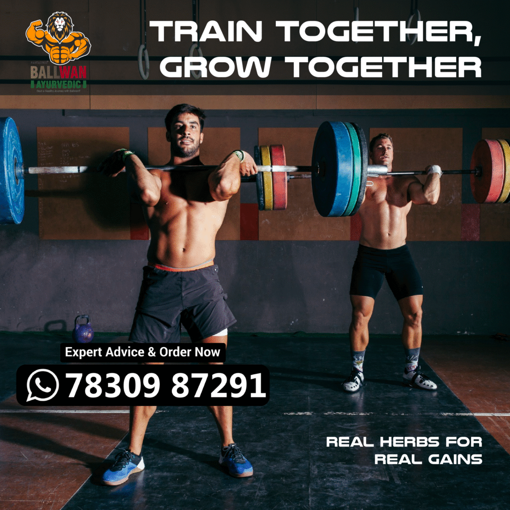
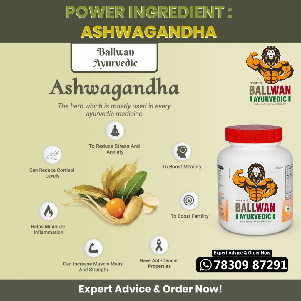
- Gym scenes (weights, athletes) paired with Ayurvedic elements (herbs, scoop of powder).
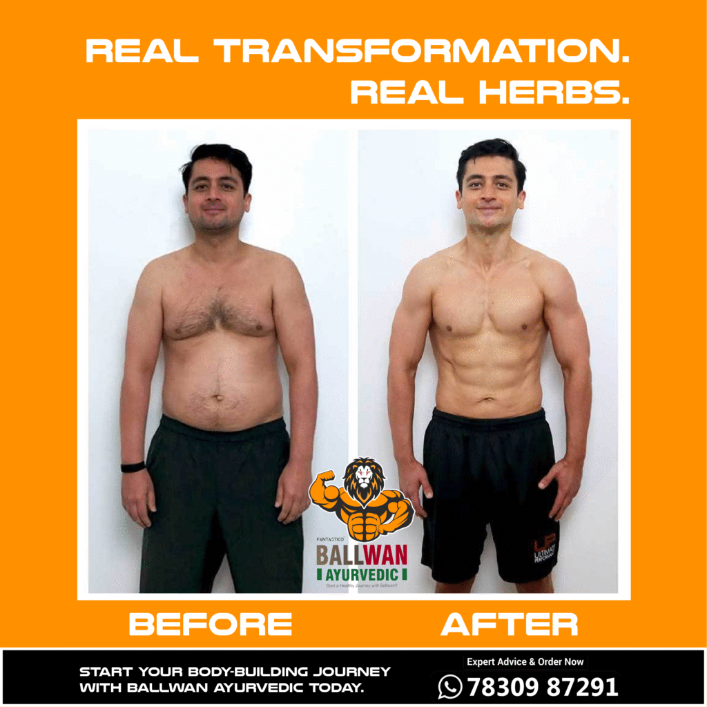
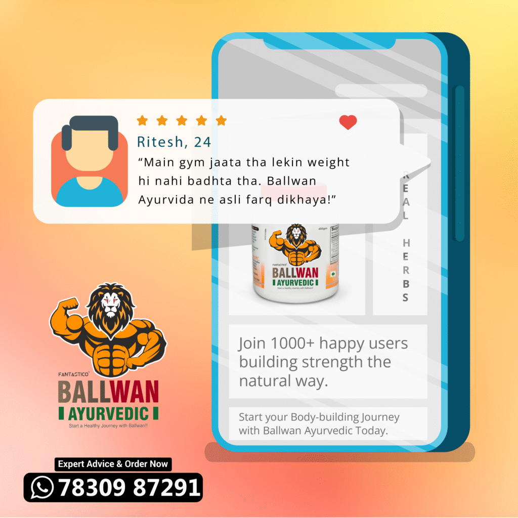
- User testimonials with authentic before/after visuals.
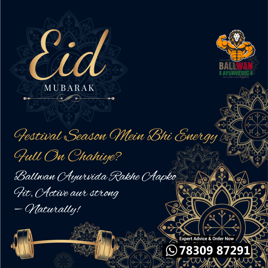
- Festive/seasonal themes (e.g., Diwali energy boost).
- Content Strategy:
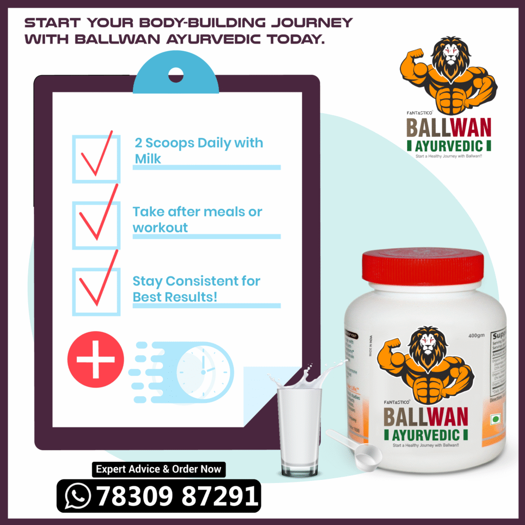
- Product Benefits: Dosage guides (“2 scoops daily”) and routine tips (“Consistency is key!”).
- Social Proof: Testimonials like Ritesh’s story (“Asli farq dikhaya!”) to build trust.
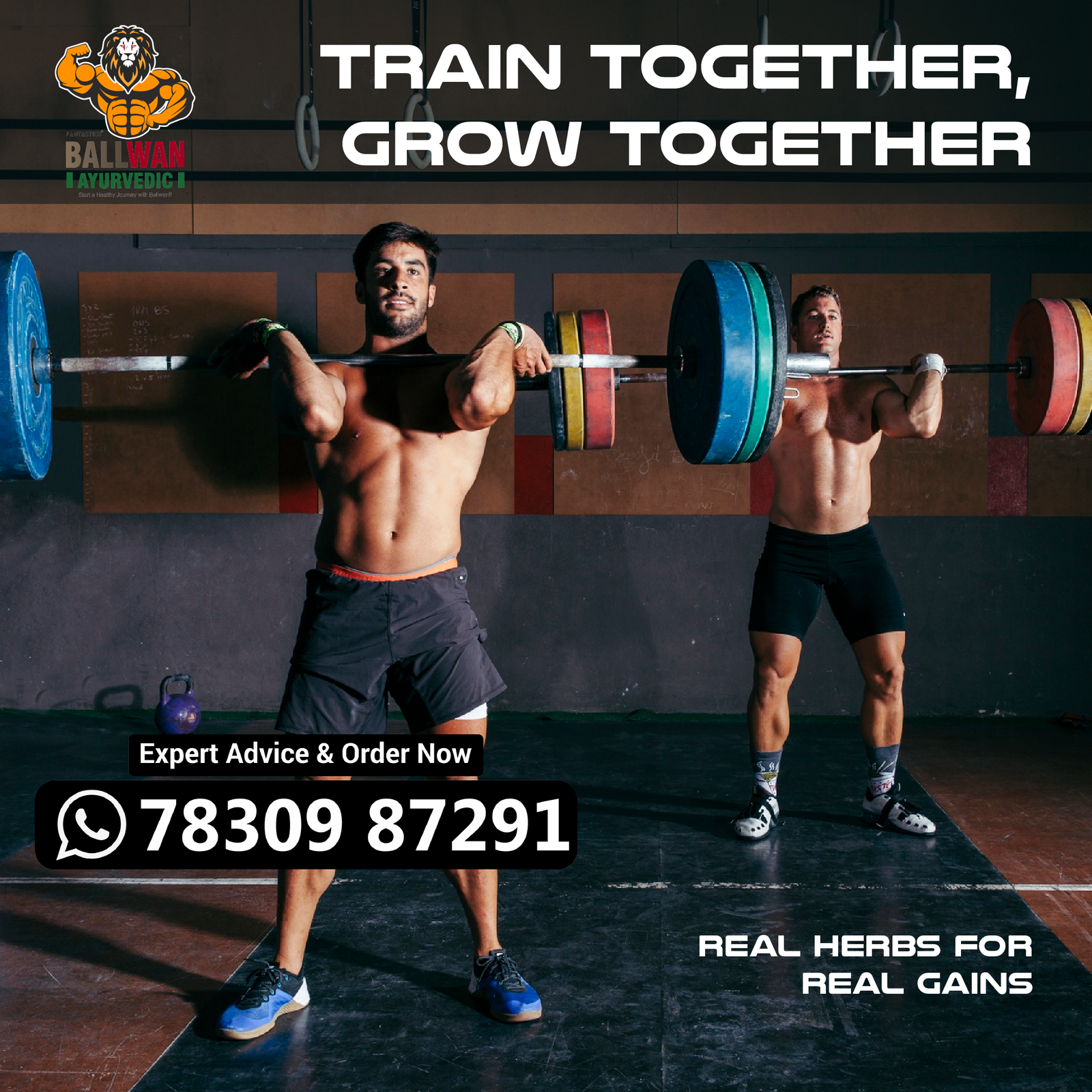
- Community Building: “Train Together, Grow Together” posts to foster gym partnerships.
- Seasonal Campaigns: Festive hooks (“Diwali energy boost”) for timely relevance.
- Platform-Specific Adaptation:
- Instagram Reels: Short clips of athletes using Ballwan + mixing routines.
- Facebook Carousels: Step-by-step guides on Ayurvedic fitness.
- WhatsApp: Direct order links via CTA (“Expert Advice & Order Now”).
- Results & Impact:
- 40% increase in inquiries, especially from gym communities.
- Higher engagement on user-generated content (testimonials).
- Stronger brand recall through consistent Ayurvedic + fitness fusion.