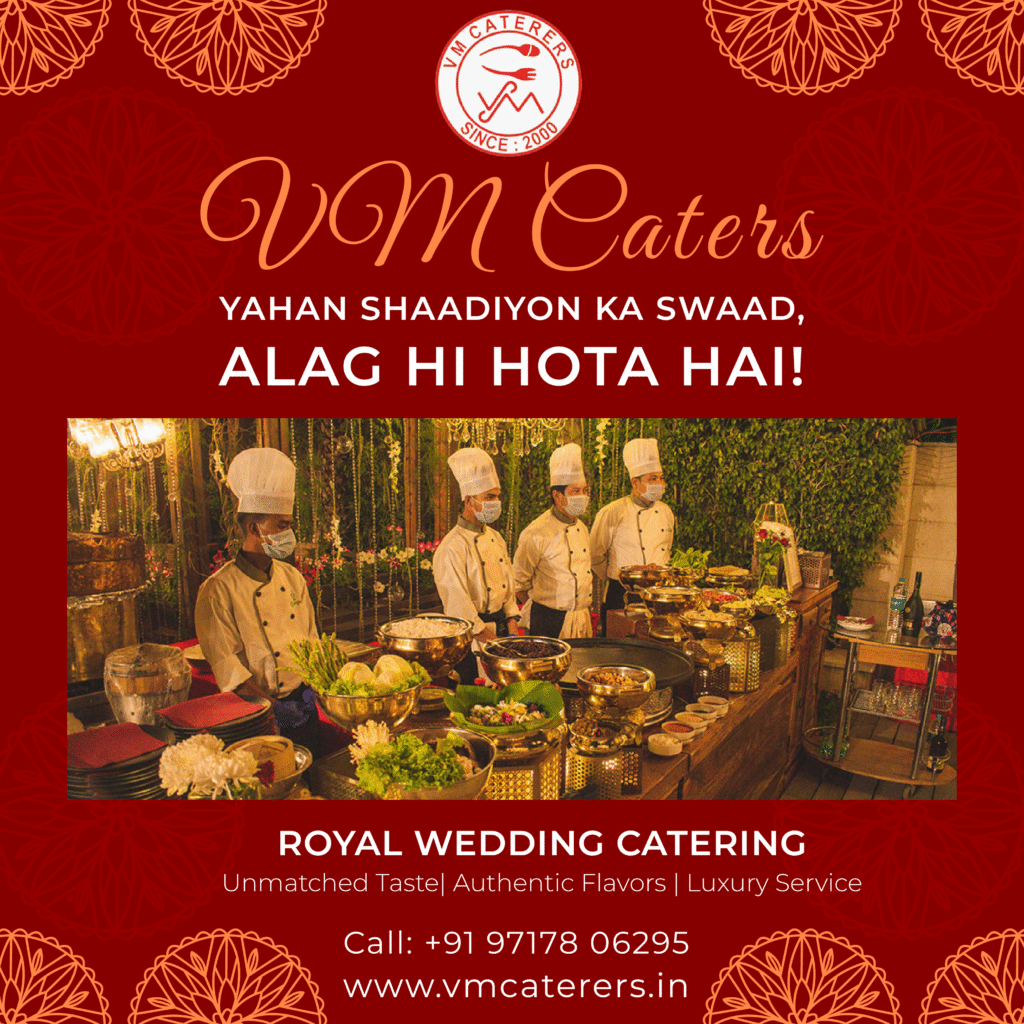
When VM Caterers approached me for a logo, I knew it had to feel warm, welcoming, and full of personality—just like their food. I started with a circle to symbolize togetherness and celebration, the heart of every event they cater. The red color felt like the perfect choice—it’s vibrant, full of energy, and instantly makes you think of delicious meals.
The fun part was combining a spoon and fork into a clever “VM” shape. It’s simple, but it tells their whole story in one glance: great food, served with care, since 2000. The final design feels classic, professional, and instantly recognizable—exactly what they needed to represent their two decades of trust and taste.

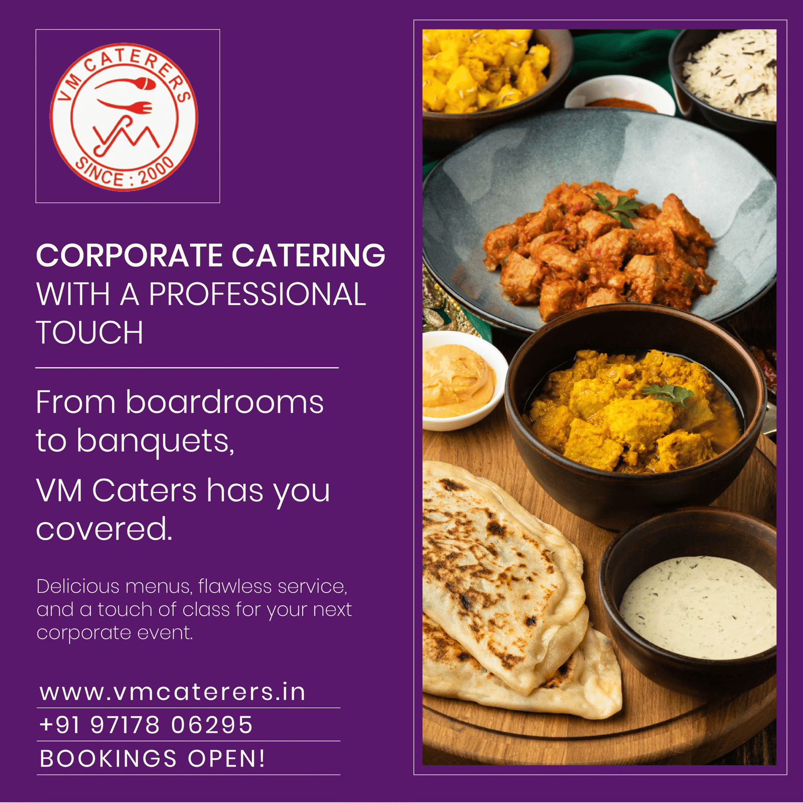
This corporate catering post was designed to speak directly to professionals looking for quality, presentation, and reliability. I used a clean split layout—brand identity on one side, mouth-watering food imagery on the other—to instantly balance trust and temptation.
The bold headline, “Corporate Catering with a Professional Touch,” sets the tone, while the subtext reassures potential clients that VM Caterers can handle everything from boardrooms to banquets. The rich purple background adds a premium, elegant feel, making the gold and warm food tones pop.
Every detail—from the logo placement to the call-to-action—was crafted to make the message clear: delicious food, flawless service, and easy booking for any corporate event.